OVERVIEW
Our client is one of North America's largest freight rail companies, moving over 300 million tons of goods annually across a 20,000-mile network. Issues include:
Visibility issues with order status and details
Order creation and management is a lengthy process
Confusing navigation across the system and within the form
New features to allow users to build orders over time
Constraints were tight: a single-page form, an existing design system, and zero operational downtime.
SOLUTION HIGHLIGHTS
A single form for the whole freight container lifecycle

From the legal info and container type(s) to the delivery journey for each container - everything lives in a single page form, organized into accordion sections by phase.
Improved visibility of orders by status
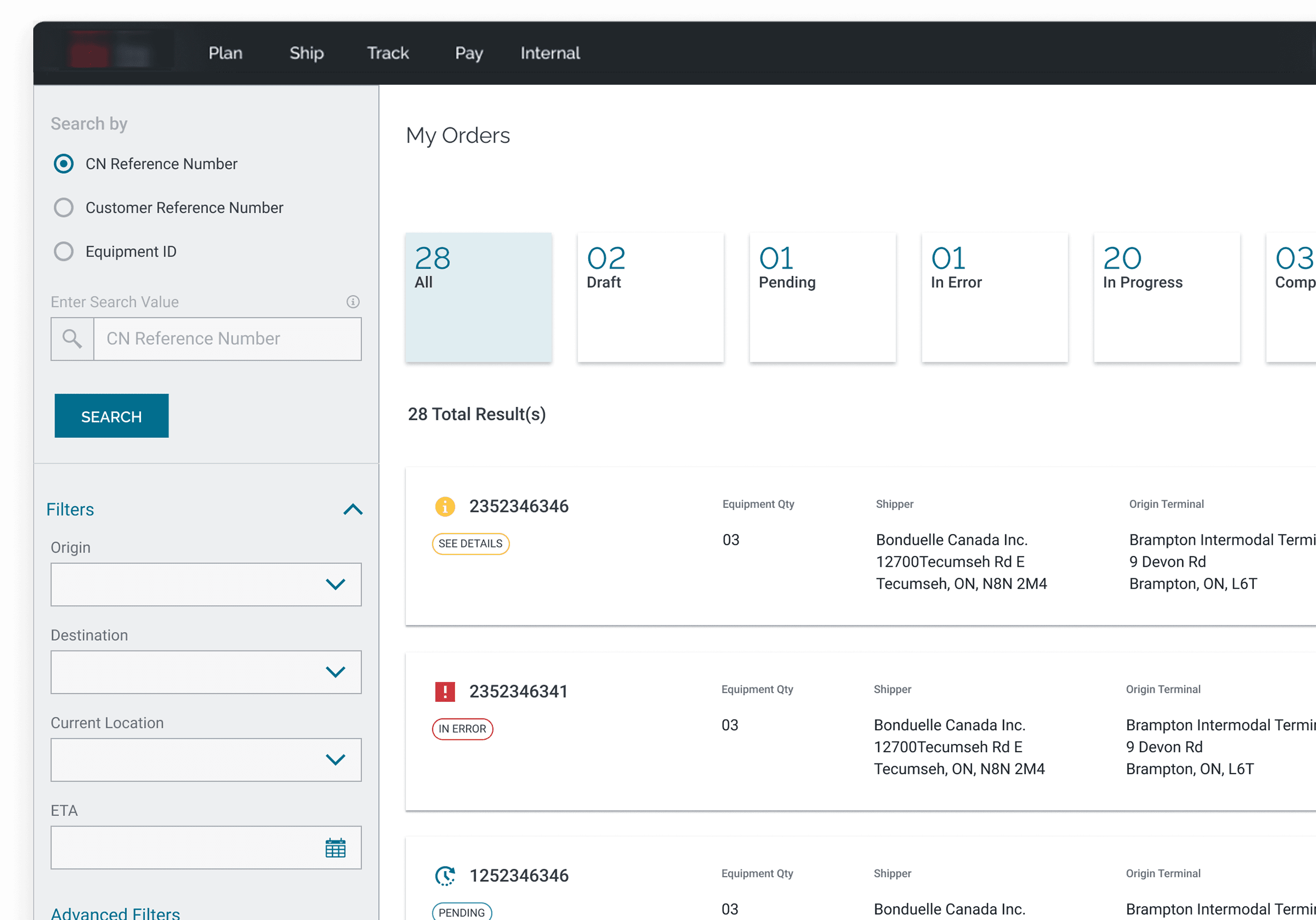
Visual indicators for different order statuses, with clear CTA buttons for orders that need attention
Making dense data easily scannable

Tables inside each accordion section for data entry and viewing, making it easy to drill down to the container-level
KEY IMPACT
02 tools
consolidated into one platform for order creation & management
40%
drop in errors post-launch. Tracked through field-level error logs and UAT
20
components contributed to the existing design system
APPROACH
Mapping complex data entry requirements
We started with existing documentation, a UX audit, and quick expert interviews to understand what data was required and when. A freight order branches depending on what's being shipped. That complexity drove every structural decision that followed.
Fill to begin order
Share legal and general info for the order
Info for all empty containers & delivery details
Info for the pick up and last mile delivery of filled containers
MVP Approach
We worked agile. I used rapid prototyping to scope MVP features with client leadership and improve usability in parallel, showing what was possible while decisions were still being made.

Structuring the information


We explored three options — tabs, a side nav with anchors, and accordions. Technical constraints ruled out the first two. After multiple rounds of discussion around trade-offs, we landed on accordions and designed to address usability concerns arising form it.
UI DETAILS
Fixing the context loss

Once a section is filled, key information surfaces in the collapsed accordion header. Operators can reference what they've entered without reopening it.
Streamline, not reinvent
In the old system, users conduct most of their activities in nested modals. Our goal was to incrementally reduce this. For the MVP, to add and edit any container level information, a full-page modal opened up.
Tabular representation for easy scanning


Once container info is added into the modal and saved, the information populates as a line item on a table. Important fields are displayed for scanning while clicking on “See comments” opens more.
Visual elements to group complex information
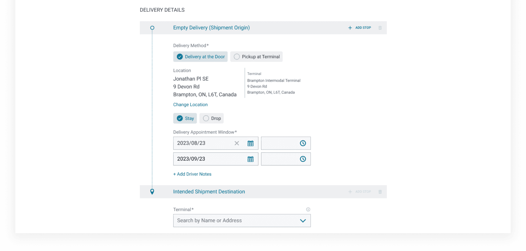
A timeline groups stop-level information (delivery method, location, appointment window) so operators move through container detail sequentially rather than facing a wall of fields.
Add multiple references in one go

References are added and reviewed in the same modal. A table on the right shows everything entered so far, so operators can add, edit, or remove in one go.
Hand-off and implementation
I led flow rundowns before each sprint with the dev team and shared screens in formats they found comfortable.
I documented and resolved discrepancies between the Abstract design library and the implemented component library that surfaced in sprint demos, working directly with the client's design system owner.

OUTRO
Usability in B2B
Usability is context-specific In B2B, It’s not what’s simple, it’s what’s appropriate. For this project, drilling down information levels within constraints was key.
Advocate with evidence
Running UATs with clients to surface the impact of deprioritized features was more effective than any deck. Hands-on testing made the cost of cutting corners visible.
Communication is the work
I'd rather over-communicate than under. That attitude is what caught the design system discrepancy and what enabled smooth handoffs