

OVERVIEW
Like any medical healthcare center, the UPMC Oncology Center presents multiple, lengthy forms to patients.
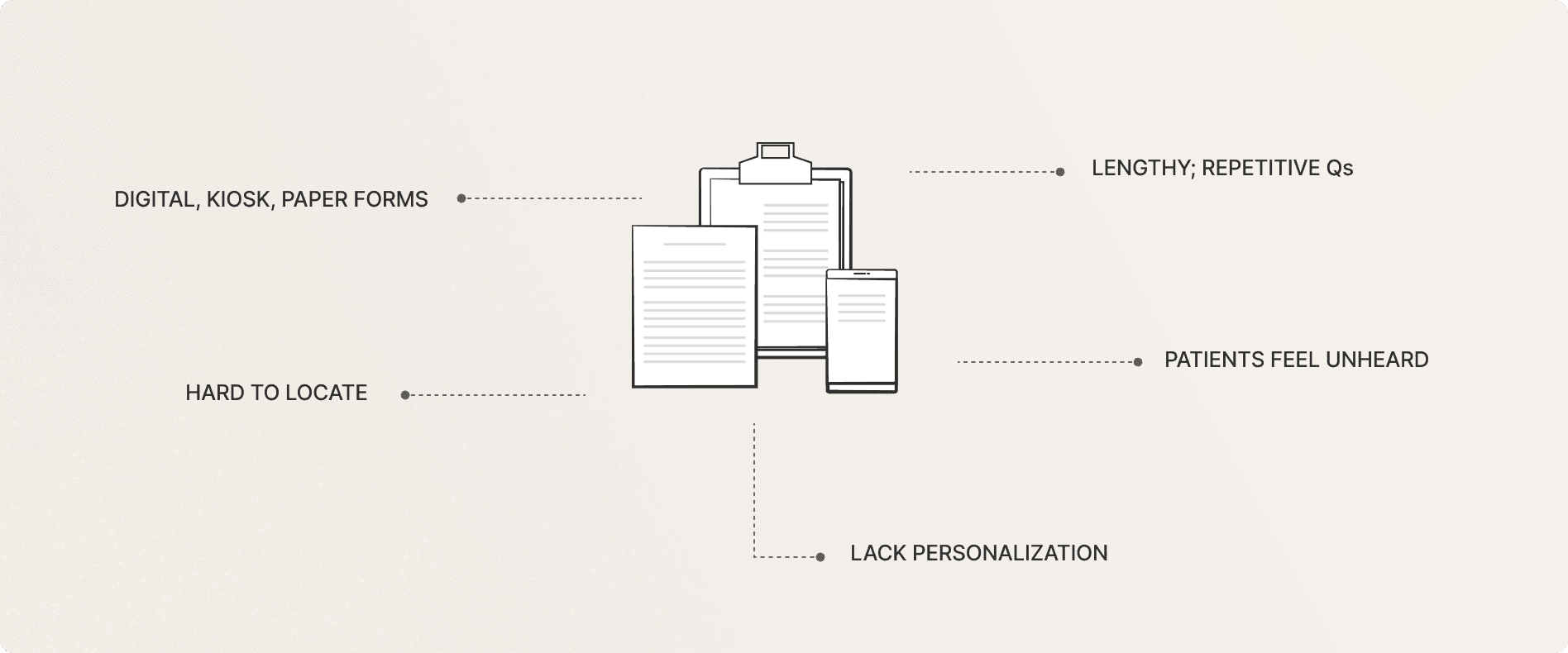
Symptom data can flag issues early, guide dose adjustments, and help oncologists stay ahead of side effects. Currently, 1 in 3 new patients complete symptom screening forms.
A personalized, unified form on the My UPMC app that asks only what's relevant to where they are in treatment.

KEY IMPACT
50 → 18 Qs
on average through conditional logic and prepopulation
~35% lift
in form completion rates from pilot testing
8/10 users
Found the post screening resources helpful and personalized
SOLUTION HIGHLIGHTS

“There’s an overwhelming number of questions”
Follow-up questions, only when relevant
Questions tailored to patient's treatment phase

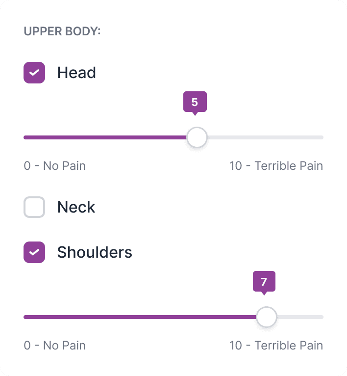
Visual indicators to help understand pain better
Closing the loop so patients know their input matters


What do Patients, Clinicians & UPMC need?
Patients: Want a simple, personalized form and want feedback that these forms are informing their care
Clinicians: Needed the data to actually be readable and actionable
UPMC: Need adoption on the MyUPMC app as they migrate off Epic
This informed the form of the solution: a mobile app with a single personalizable form that feeds into the EHR.
What is even in these forms?
Across 10+ forms, I deduplicated questions and categorized them.


How do we cut the noise?
Using LATCH principles, we grouped symptoms by organ system, journey phase, and
patient needs - surfacing only the most relevant questions in a way that made sense to them.

How can we personalize them?
Symptoms vary by phase, person, and medication. To identify which questions belonged and in what order. I led workshops with patients, clinicians, and staff to build logic diagrams that informed the form's conditional logic and personalization model.



Ask SOS questions upfront, irrespective of phase
Customize form order based on phase of cancer journey
Define a frequency to ask each category of Qs
UI DETAILS
The UI was built to UPMC's existing design system. Components, color, typography, etc were pulled from their component library
Icons for every symptom
Abstract symptoms are hard to parse quickly. Line icons ground each option in something recognizable and reduce cognitive load for patients who may be fatigued or anxious.

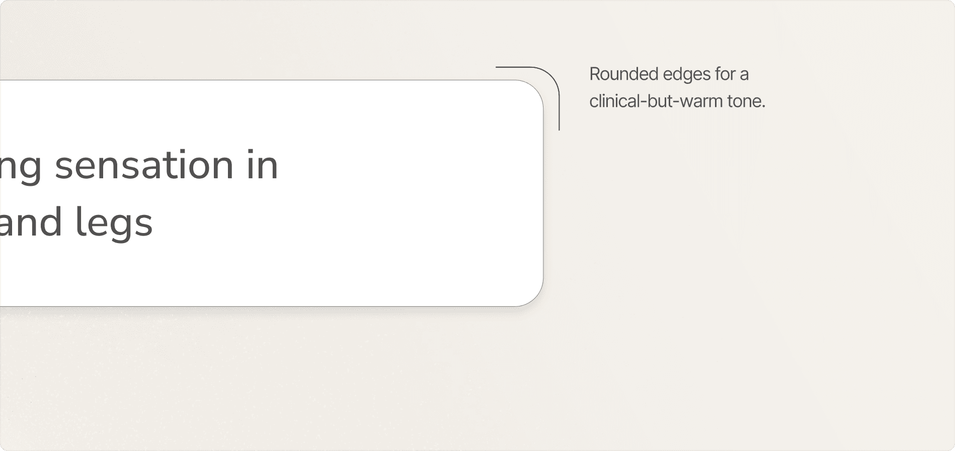
Rewritten symptom definitions
The original language was written for clinicians. I rewrote symptom labels and descriptions in plain language so patients could self-report accurately without guessing what a term meant.
Axillary pain
Underarm pain
Xerostomia
Dry mouth

OUTRO
Workshops are about trust, not agendas
Clinicians and patients needed to feel safe enough to be honest before any of the research could actually go anywhere.
Learning to lead
I learnt how to guide team efforts across research planning, synthesis, and stakeholder alignment.


